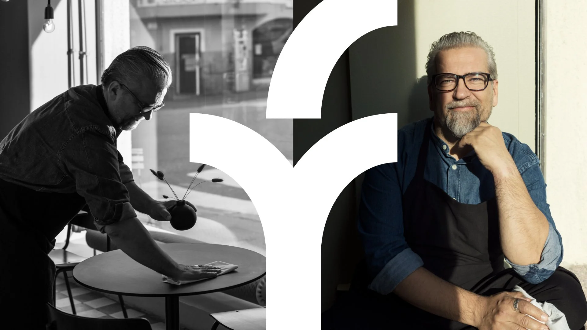
Brand transformation for the insurance company Fennia
Finnish insurance company Fennia came to us with a need to revitalise their brand. With new players cropping up and shaking up the industry, Fennia realized it needed to do more to retain its position than to let its 140-year history or their stainless image do the talking. We
wrapped our sleeves and crystallised the brand into something that builds on this foundation, but takes on a whole new direction in its customer-centricity and forward-looking approach.
We came to the conclusion that Fennia stands for continuity — enabling its customers to design their lives and business after their own needs and preferences and giving them the courage to do the things they have always dreamed of doing.
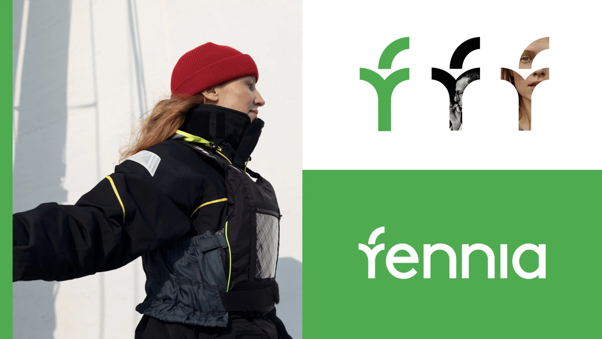
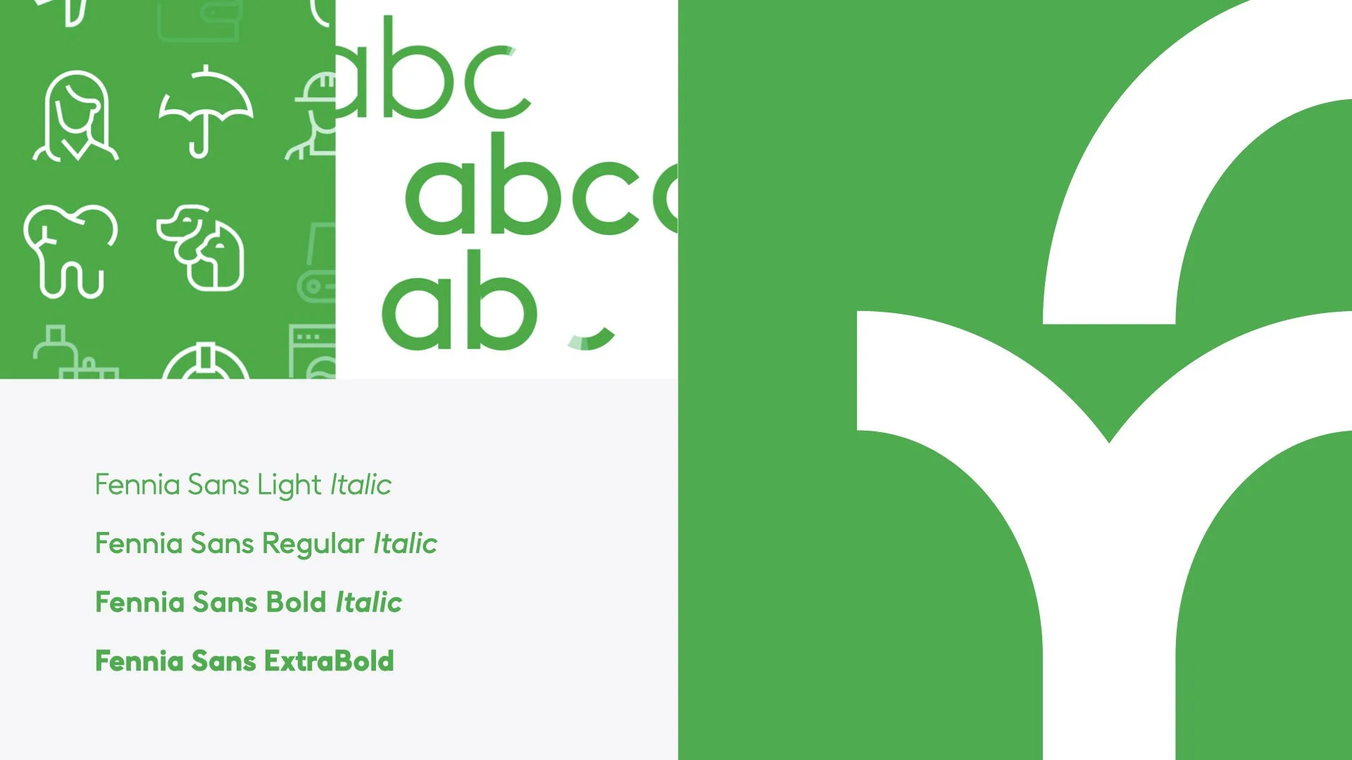
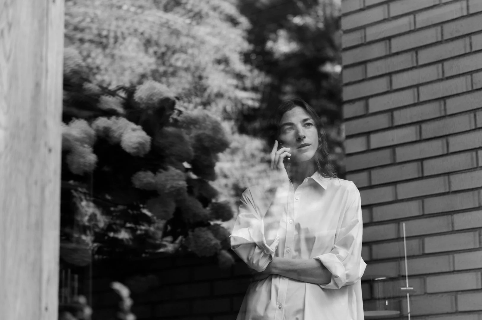
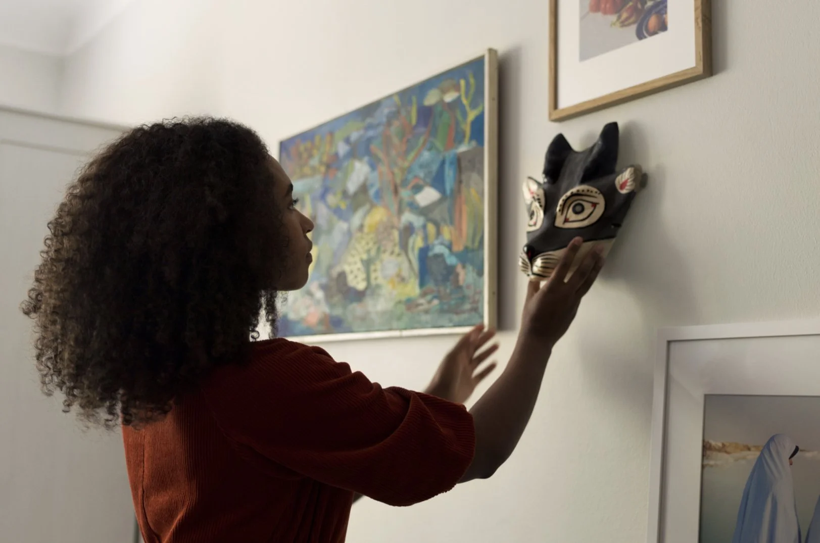
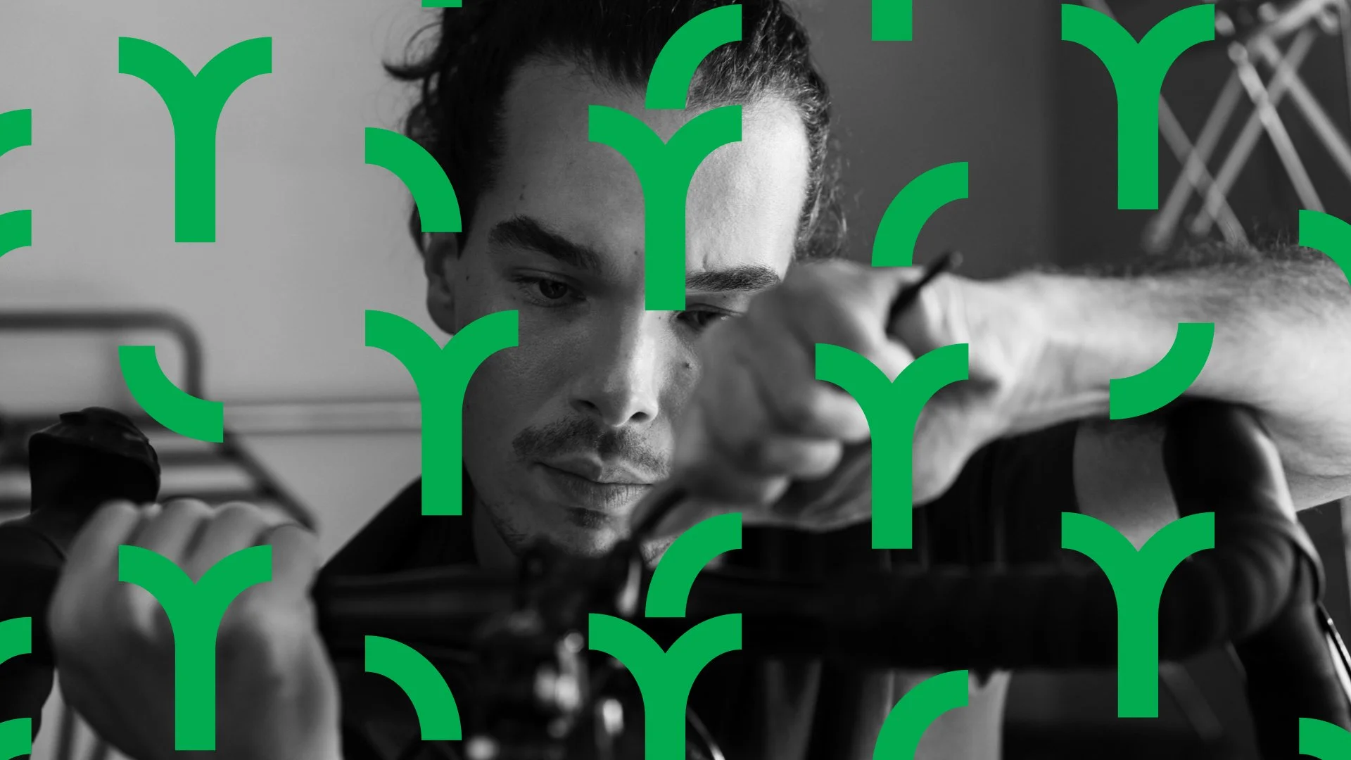
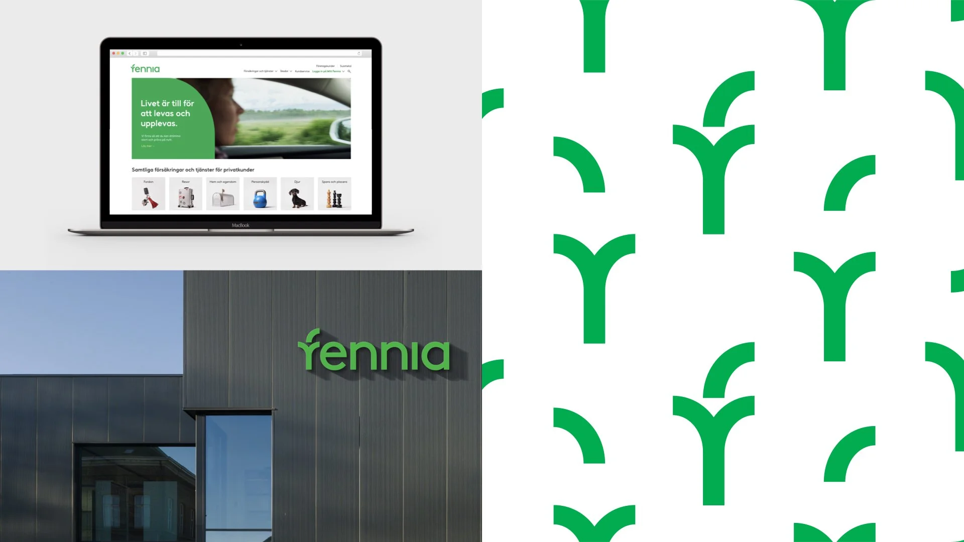
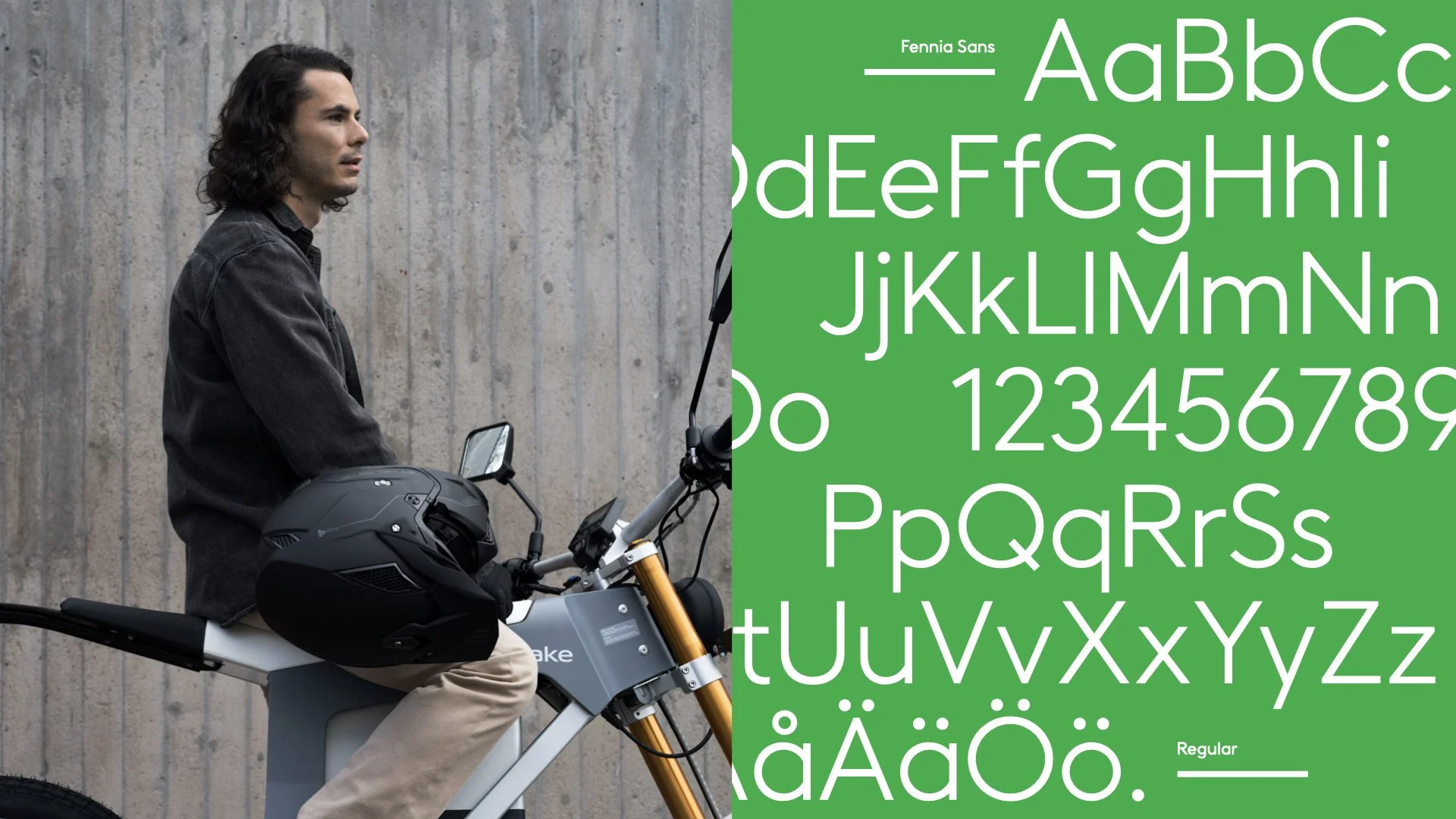
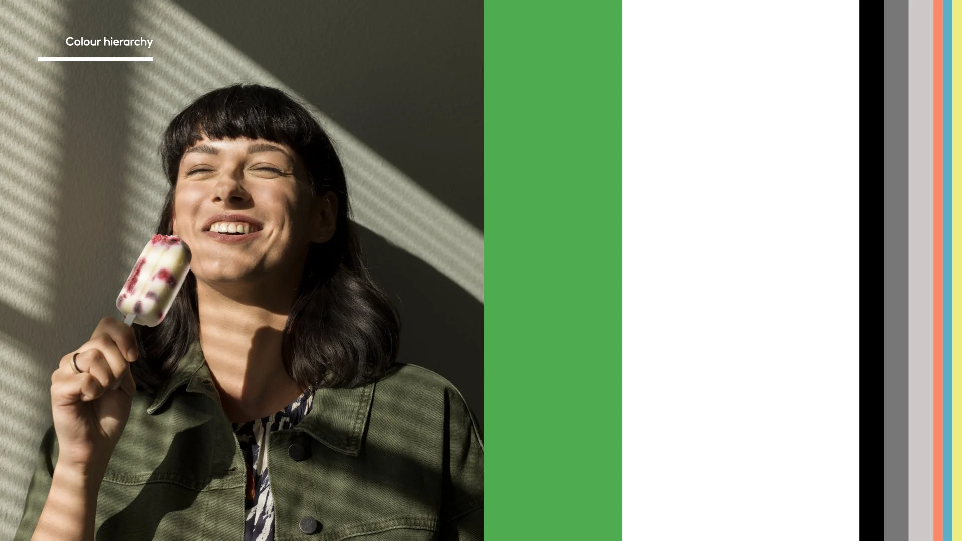
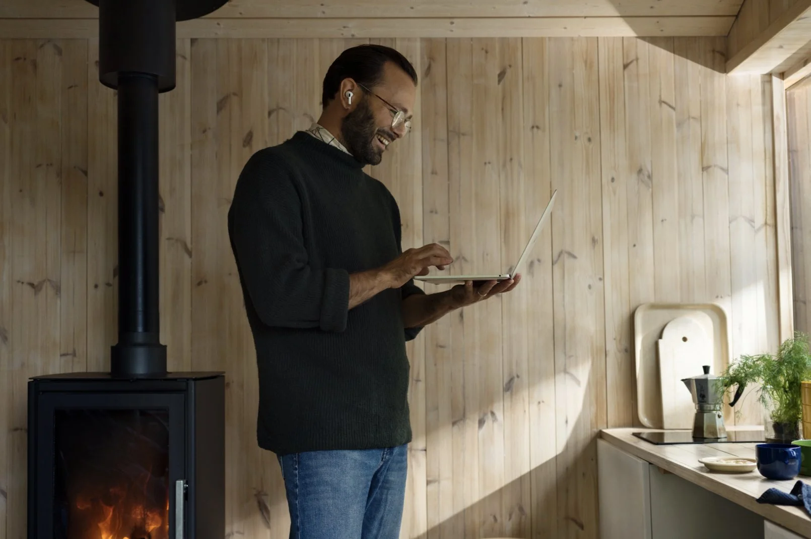
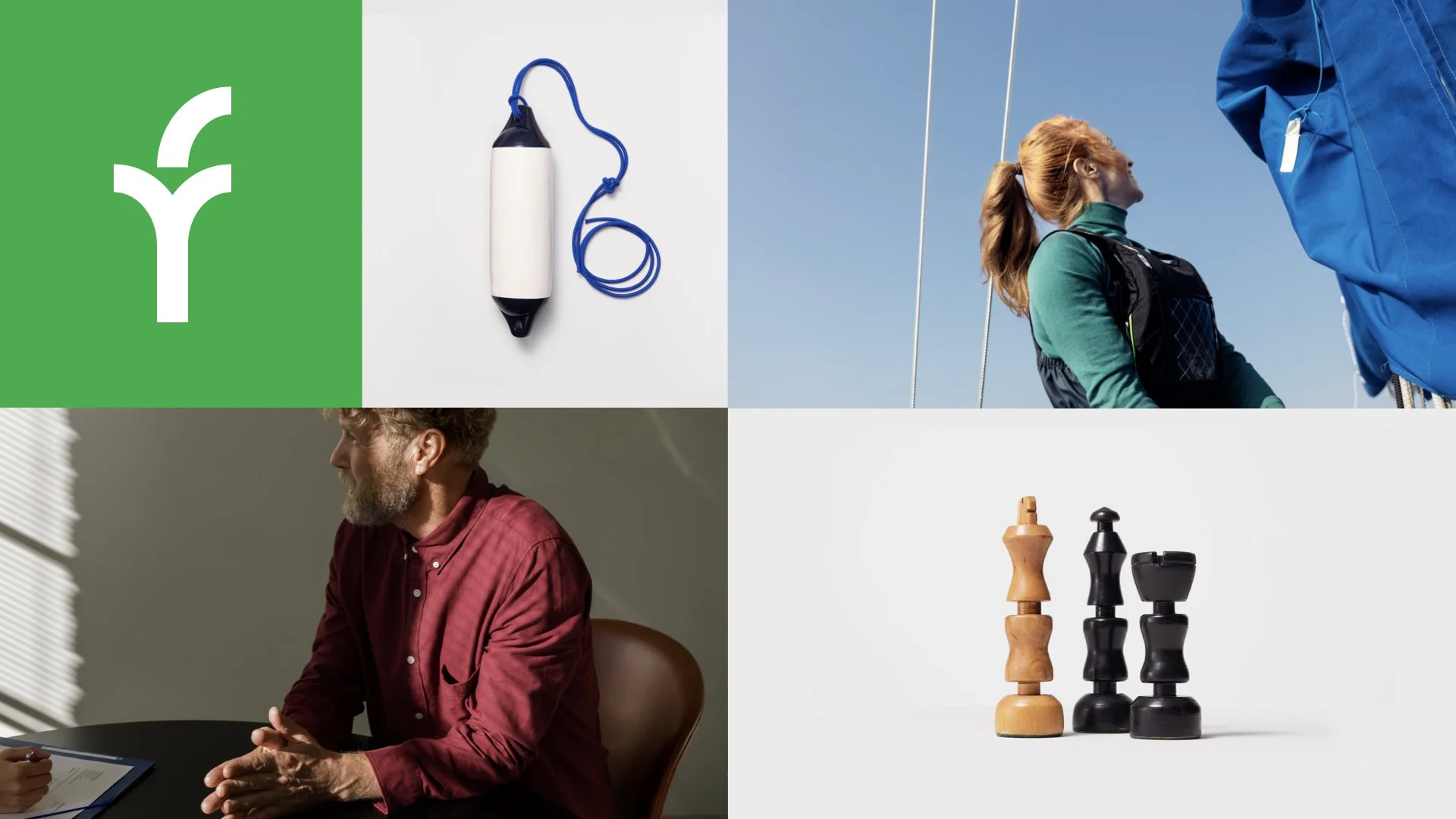
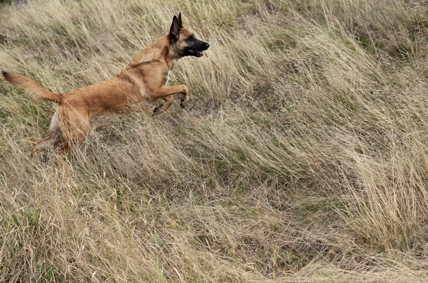
This position laid the ground for the brand expression development. We focused on modernizing the brand with a new logotype featuring the ‘sprout’ — a symbol for growth and continuity (but also a nod to the ’old’ Fennia) — a colour palette to support it and a custom-created typeface with a friendly, clean and current feel. We also updated the brand’s image tonality and communication to reflect life as it happens, once again reflecting the brand’s position and helping to create and strengthen emotional connections with its customers.
We captured a brand that is a human-centric, approachable enabler for people and businesses alike. A brand that strives for a familiar, personalised experience in every encounter and wants to encourage living life to the fullest instead of warning about ’what might happen’.
Role: Creative direction, creative strategy, art direction
Client: Fennia
